

Soul Community
Identity
Brief development
Moodboards
Brand identity
Brand guidelines
Logomark
Graphic elements
Loved working on this visual identity for Salvation Army pioneers in SE London. They needed an umbrella brand for all their positive happenings in the community (including choirs, yoga, barista training to name a few), to express the diversity of the community they have built and of the local area, the power of community and ability to flourish.
The shapes in the logo and brand pattern are taken from areas of an arial map of SE London focussing on the Deptford area. Prizes for who can spot Deptford Creek!
The simple circle represents community, welcoming and togetherness.
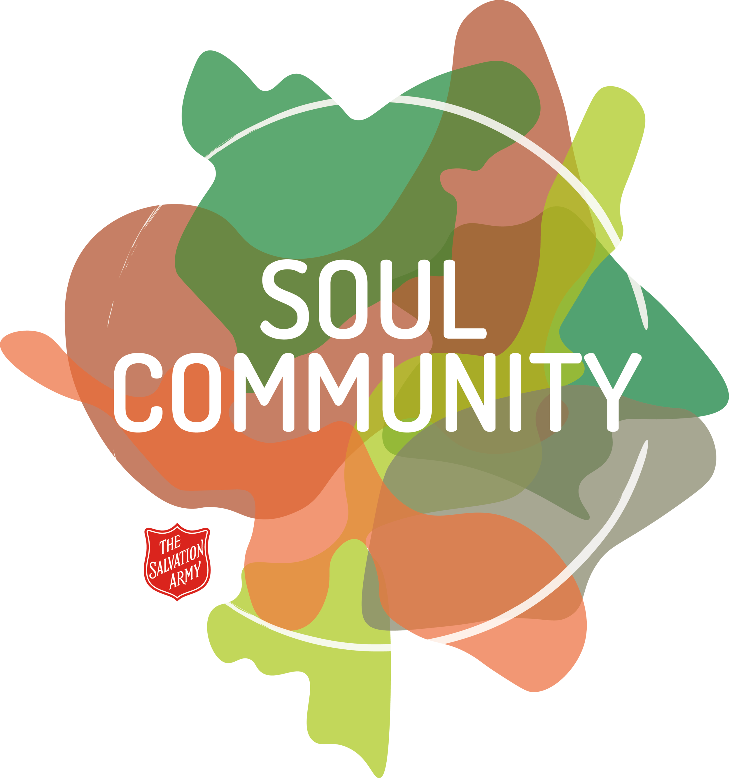
Logo design, overlapping shapes drawn from an arial view of a map of SE London,
Simple incorporation of the Salvation Army sheild.
